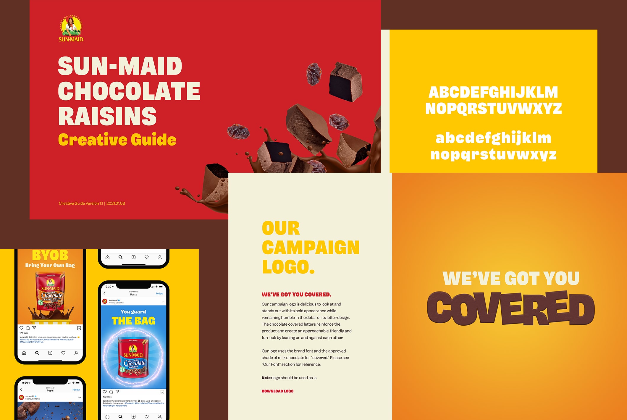
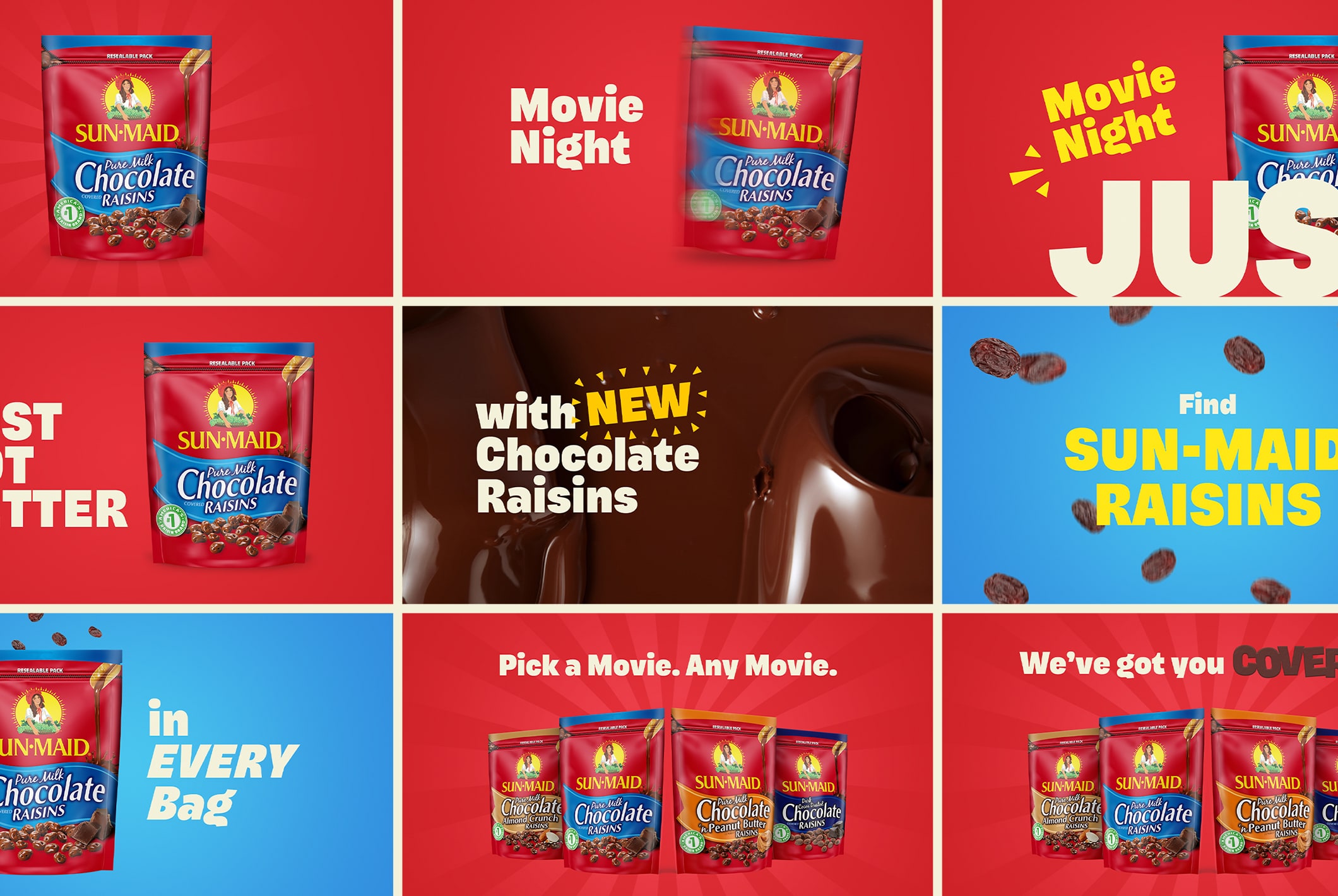
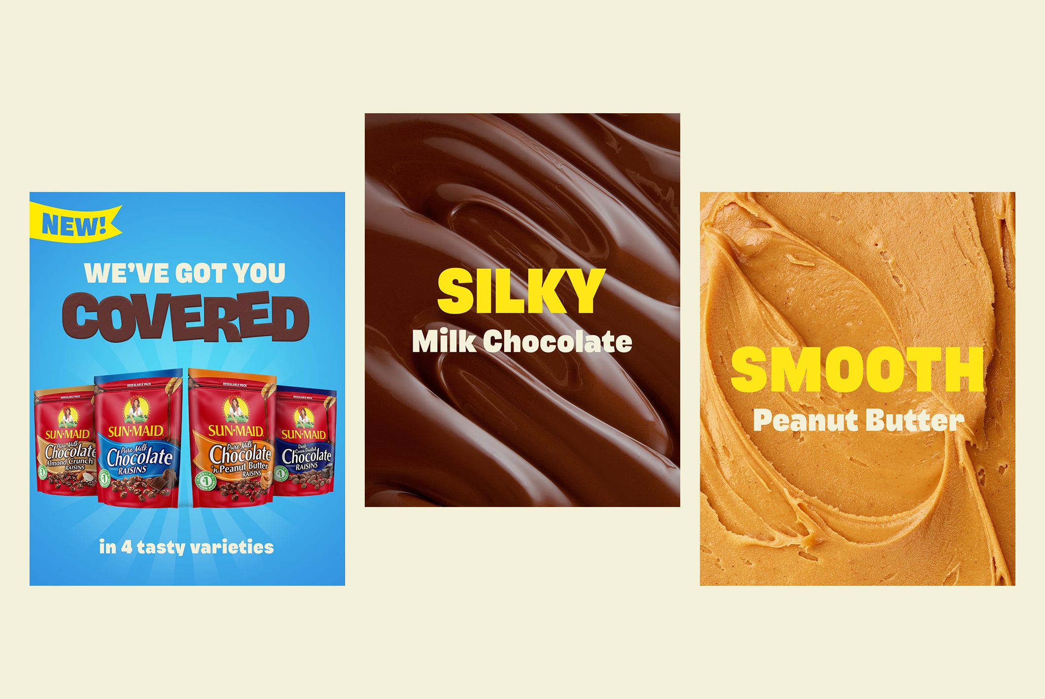
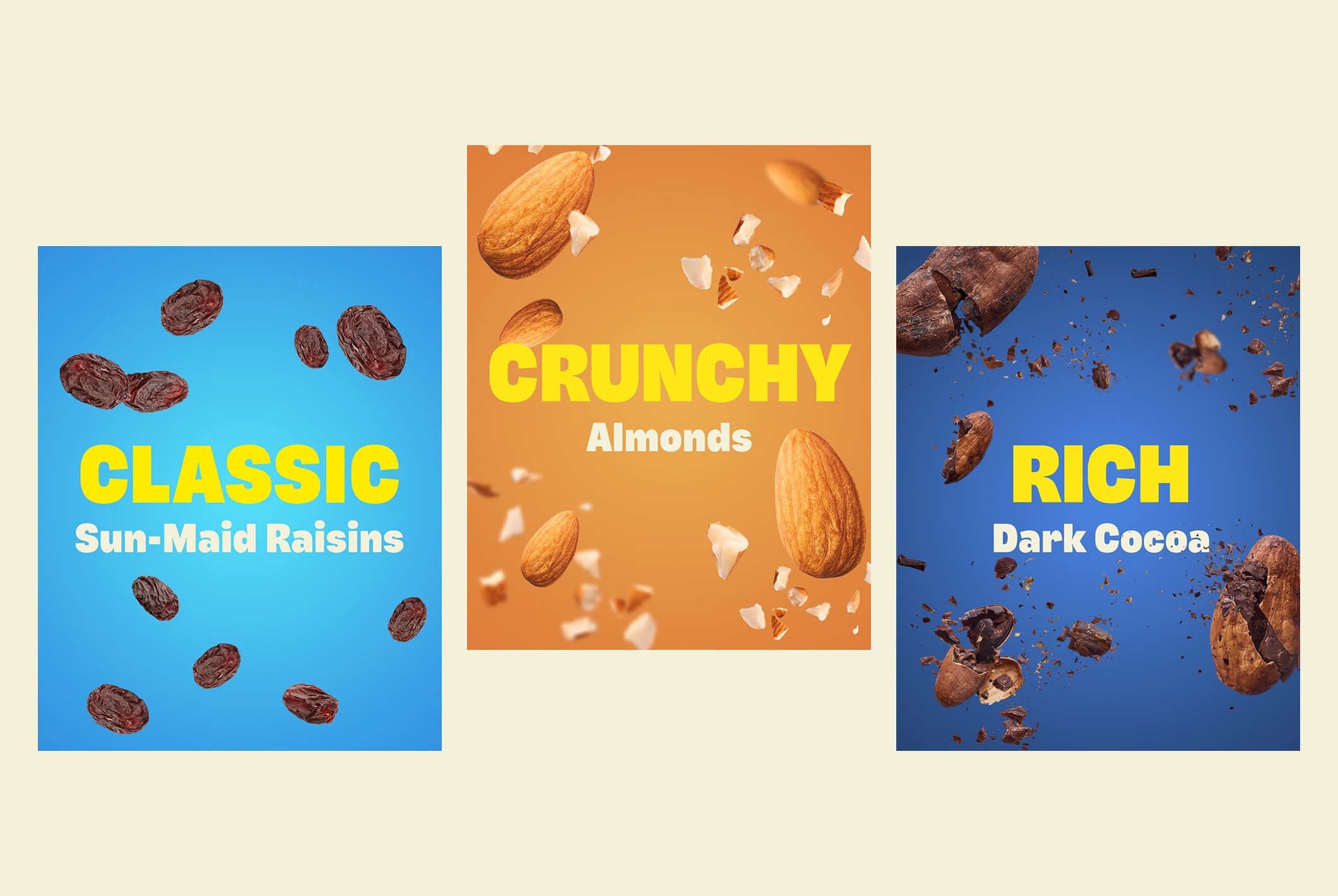
Sun-Maid raisins now come covered in milk chocolate, cocoa, peanut butter and almond crunch. We were asked to help launch these yummy, new varieties. We developed a digital visual identity and social campaign focused on usage occasions and each new SKU’s premium ingredients — using Sun-Maid Chocolate Raisins as both a vehicle for creating family moments as well as a trigger to remind our audience of family. From Marvel-lous family movie nights to getting you through those 4PM meetings, every memory starts by sharing the sweetness of a surprisingly wholesome treat.
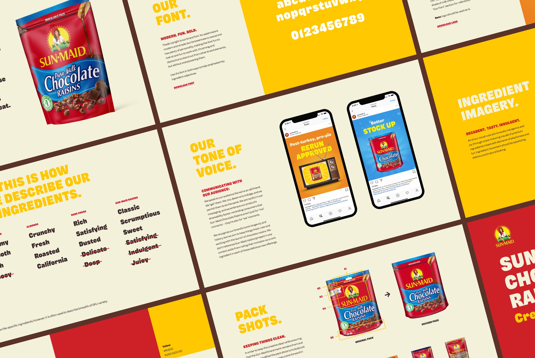
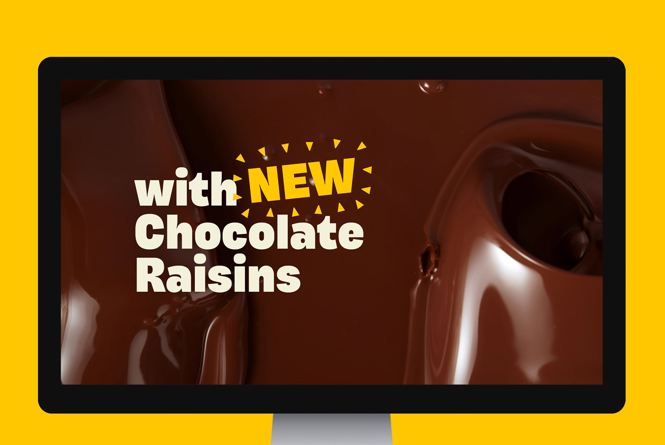
The visual identity needed to standout and be delicious to look at. All of the visual cues in the designs were chosen to evoke indulgence and joy through crave-inducing visuals of premium ingredients mixed with elements of playfulness and fun. The bold typography has plenty of personality — it’s strong and distinctive allowing it stand out and emphasize key words describing the ingredients. The campaign logo reinforces the product with its chocolate covered letters to create a yummy and approachable lockup. In order to keep the creative clean and keep this nostalgic brand front and center, I created new package mockup assets that were simplified, helping the logo come forward in the designs.
Creative Director: Ed Adams Creative Copywriter: Katie Oldenburg In-House: Revolution Digital