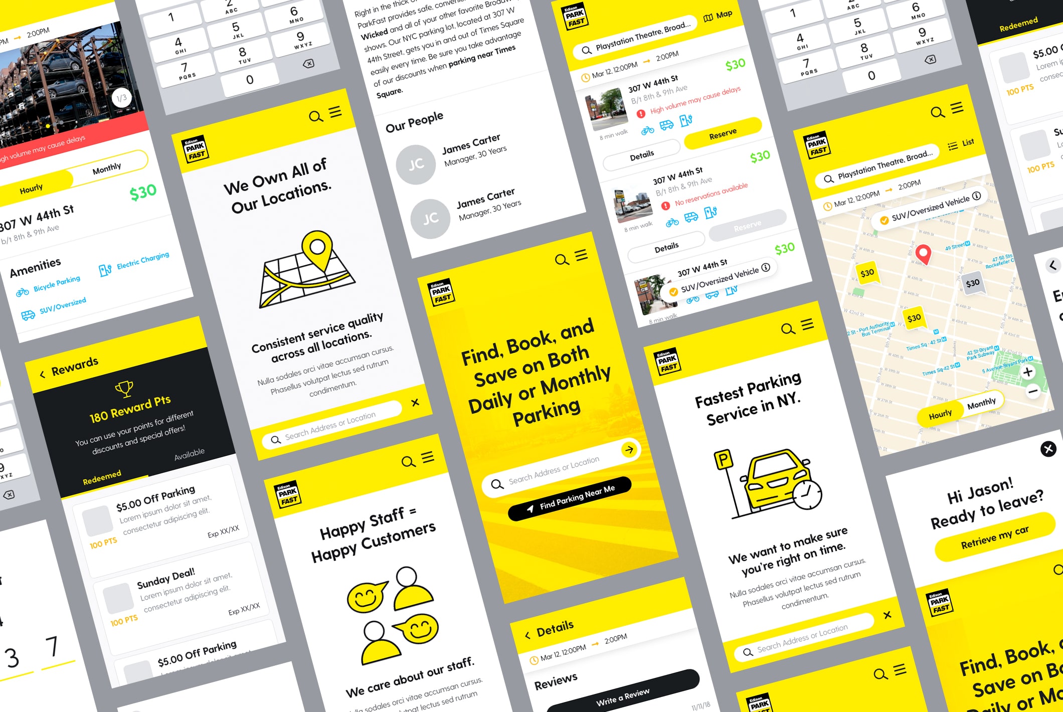
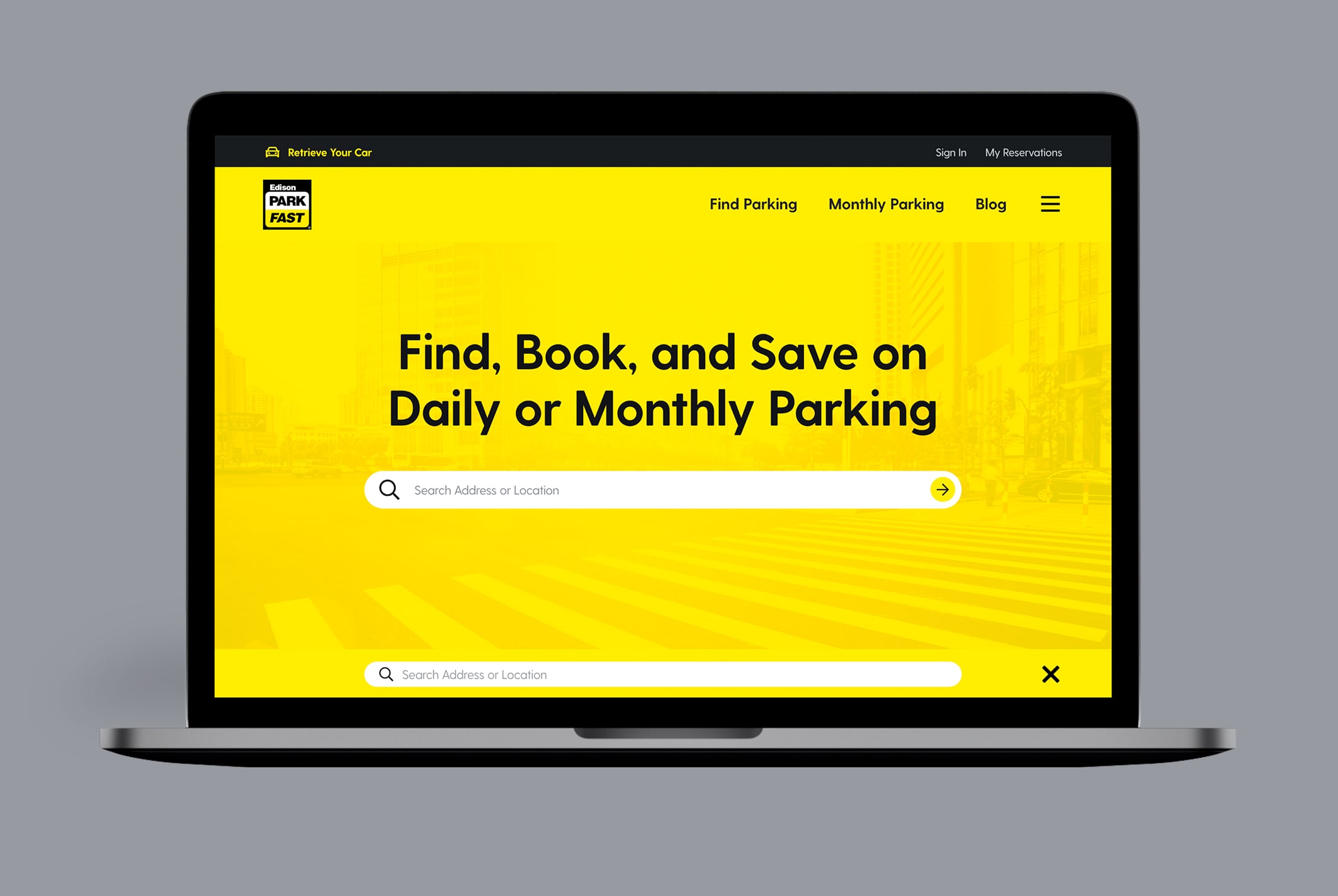
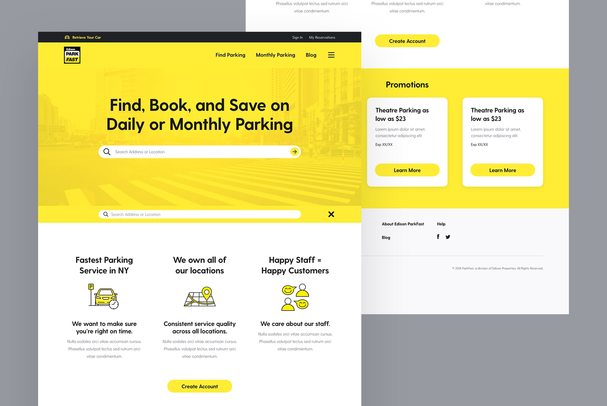
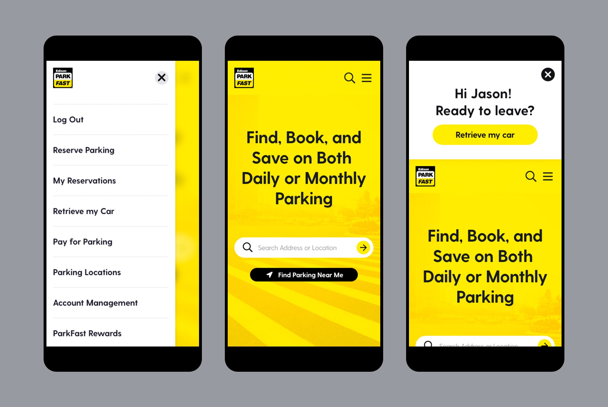
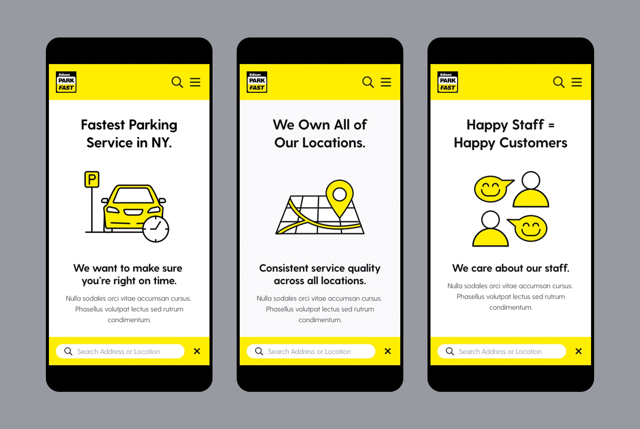
Parkfast had a website that felt static, outdated and did not provide a seamless booking experience for its customers. We created a refreshed brand look along with a new customer journey that captured Parkfast’s approachable character.
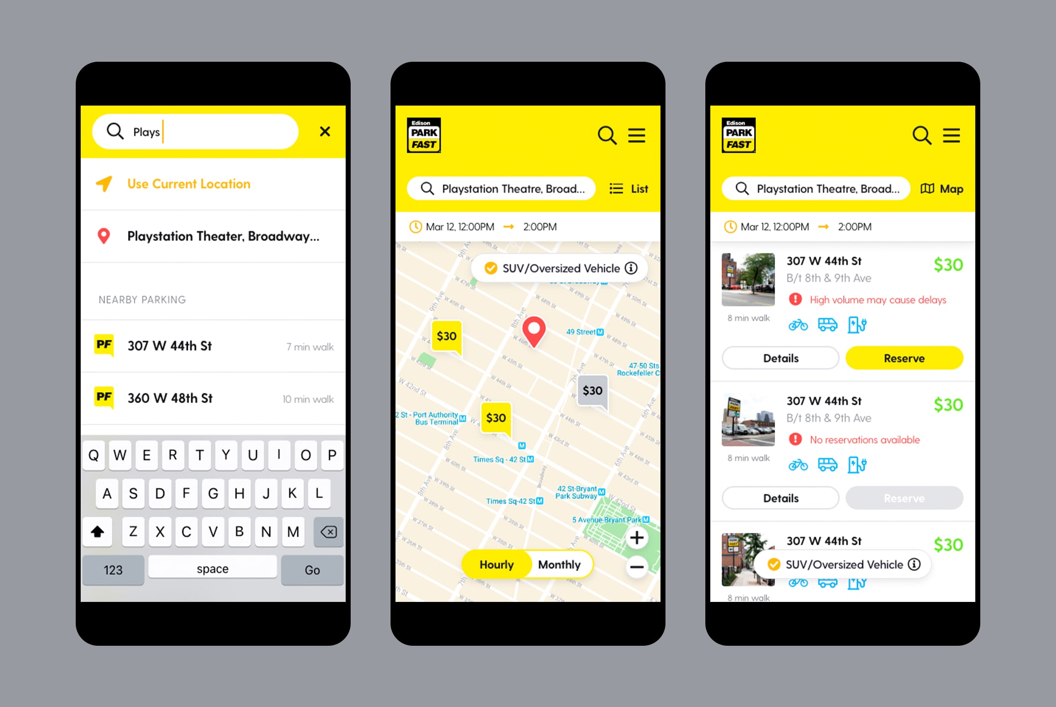
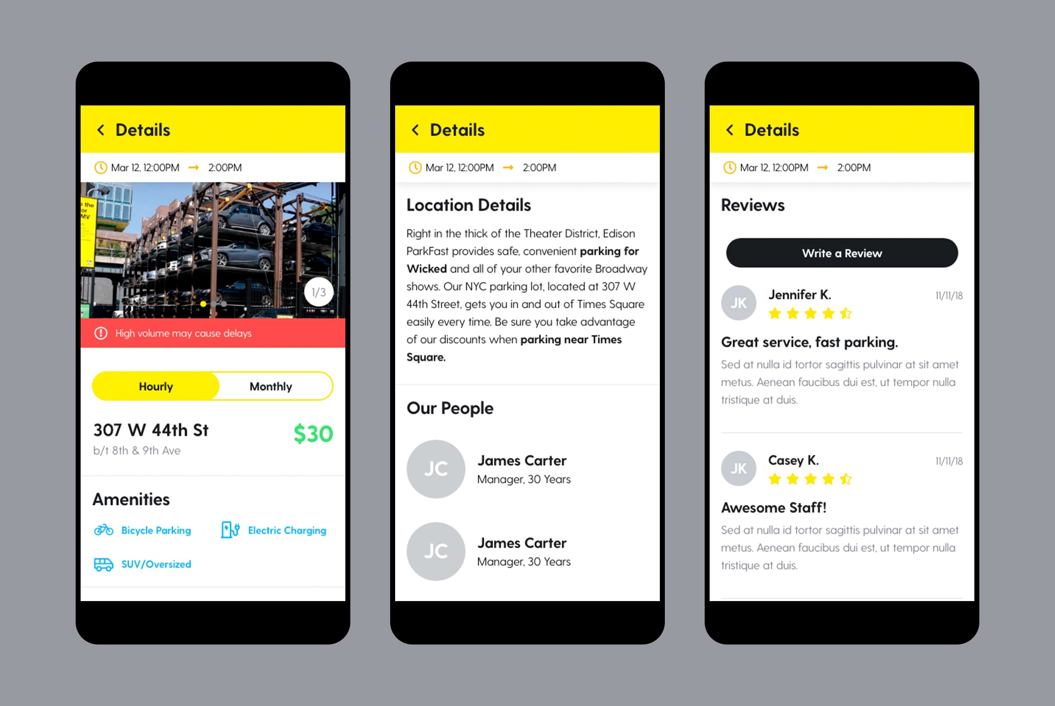
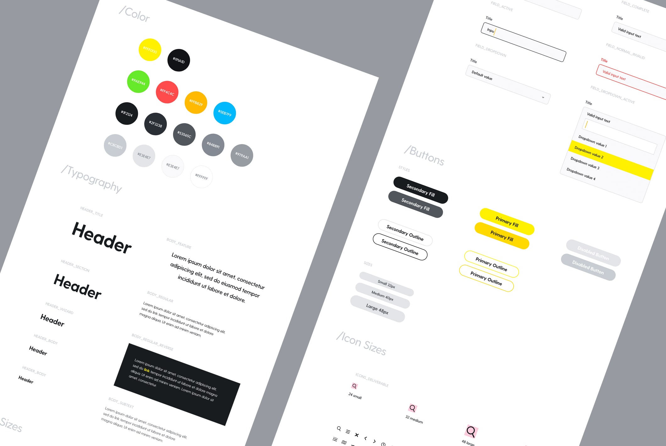
I began with creating wireframes in order to organize the structure of the website to ensure that the process from searching to checking out was simplified and streamlined to the best of its ability. I then needed to create a visual brand identity that would capture Parkfast’s approachable and friendly character. I did just this by using Parkfast’s yellow as the dominate color and choosing a typeface that was modern and clean with a fun personality. I also designed custom icons to help give the brand a more playful tone and appeal to the brands target audience.
Creative Director: Ed Adams Creative Copywriter: Katie Oldenburg In-House: Revolution Digital